Correlation between degree and abundance Graphing Pearson correlation between degree and abundance.
cor_degree_abs.RdCorrelation between degree and abundance Graphing Pearson correlation between degree and abundance.
Value
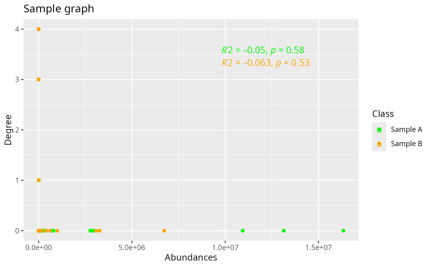
Returns a correlation plot between the degree and abundance of each node. It shows the R-square and p-value.
Examples
data("mlnet_dstoolAB")
data("tc_dstoolA")
data("tc_dstoolB")

# Create abundace list
lst <- list(tc_dstoolA, tc_dstoolB)

# Create a vector for layers' names
n <- c("Sample A", "Sample B")

cor_degree_abs (g.list = mlnet_dstoolAB, abs.list = lst, layer_names = n, layer_colors = c("green", "orange"), title = "Sample graph")